RGBW bulb research, or How to make a UI design that works. Part 2
- March 30, 2022
- by Ezlo Admin
Welcome back to our research of the most convenient light bulb UI design. In the previous article, we described the background of the problem and the plan of the experiment we performed to resolve it. Just to refresh — we selected about a dozen people from among our colleagues and asked them to draw their “perfect UI” to control a smart multi-colored light bulb with a dimmer function and white balance setting.
Stage 2 preparation
After we spoke with the last participant, we immediately began to analyze and discuss all concepts that our respondents created and restore all UI elements in a mockup format. We also added a couple of bulb control elements that we thought were practical and prepared a set of UI building blocks for the next stage of our experiment:
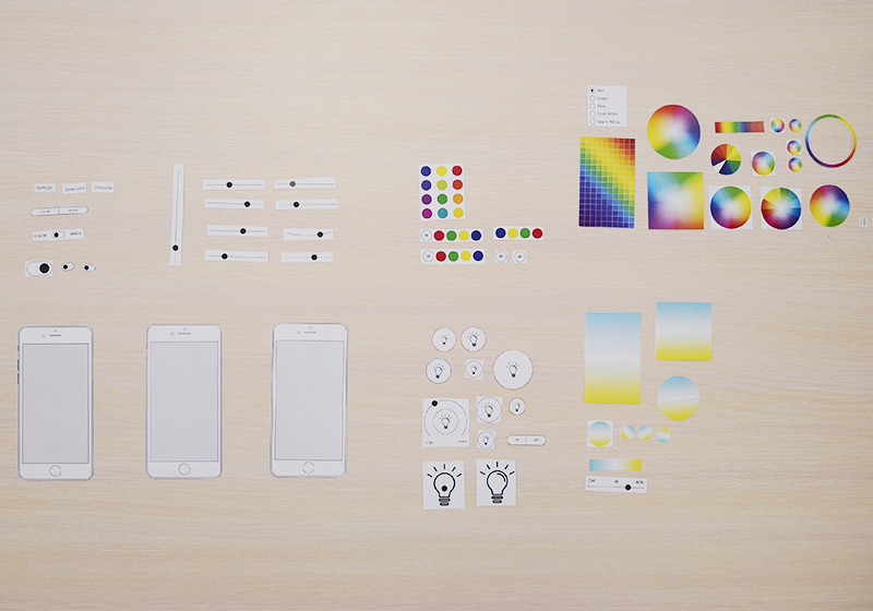
For our second meeting, we reconstructed the UI mockup for each respondent in accordance with what they drew at the previous stage. This way, we reminded them what we were talking about during our previous session. Looking at the mockups, our guests could recall the details and confirm that the mockup represented their UI concept vision. At that point, we asked our respondents to look at the UI elements suggested by others and to try modifying their own concepts if they saw something they liked more or found more usable.
We specifically focused on “modifying” the concept, rather than building a totally new one. This way, we minimized the effect of the previous experience. Sometimes, strong restrictions can make imagination fly. In our case, we restricted our respondents with the set of UI elements on the table.
We always took a photo of each UI concept before its author began redesigning it and after, thus, we made sure nothing was missed.
The “Build Your Template” game
At this stage, our respondents acted in a very different way. Some people immediately said they were happy with the design and did not want to change anything (it should not be very difficult to guess their profession and background). Others exclaimed” “Wow! Never thought of it!” and enthusiastically set about rearranging the elements in their templates. At that point, people could hardly fit all elements in the same screen and were suggesting scroll bars or additional screens. We began hearing such terms as “swipe”, “double tap” and “long press”. The game started to get really exciting, and some sessions lasted an hour or longer, when people tried to fit all UI components in their templates. Sometimes, the UI component blocks we prepared were not enough, and we had to quickly make some more or update the existing ones.
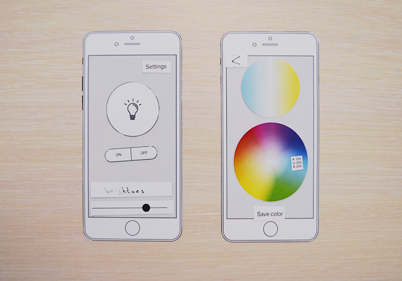
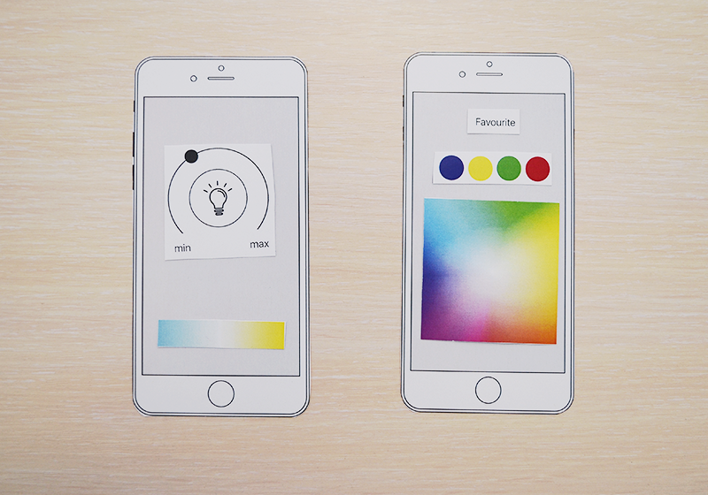
The majority of respondents changed their original concepts, and we began to observe two distinct patterns that our users followed. While the ON/OFF function was more or less the same, the option of saving the favorite colors or confirming/canceling the selected color had a variety of implementations.
Besides, we noticed an interesting trend in dimmer implementations. Some respondents set the brightness in percent, while others — as a scale from minimum to maximum. Here, we always asked the question: “How do you expect the light bulb to respond when you move the slider all the way to the left? Should it turn off (0%) or remain on at the minimum brightness, like a night lamp (~10%)?” Depending on whether the respondents set the brightness in percent or as min/max, they expected the light bulb to behave accordingly.
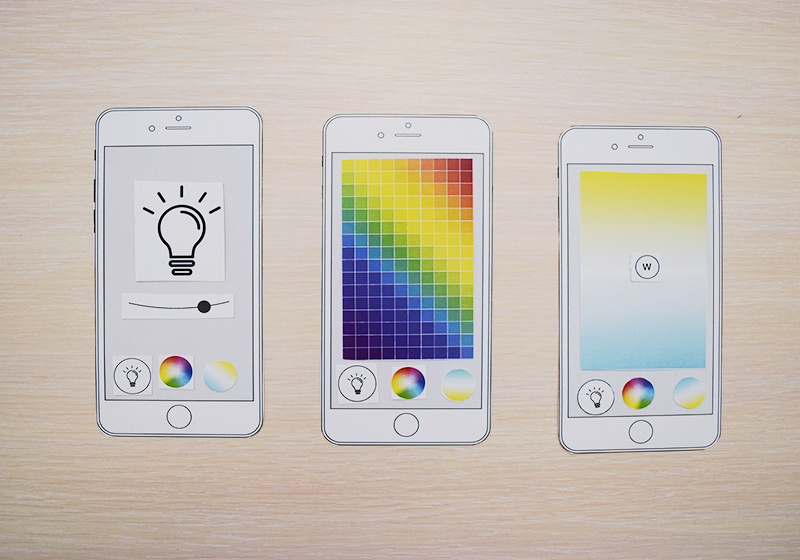
Below, you can see some examples of the UI templates created at the second stage of our experiment:
The semi-finals — building two prototypes
While the last respondents were still creating their updated UI templates, we could already see two main concepts. Roughly, we could divide all suggestions into two basic categories:
- Both the RGB setting and the white balance setting on the same screen
- The RGB setting and the white balance setting on different screens.
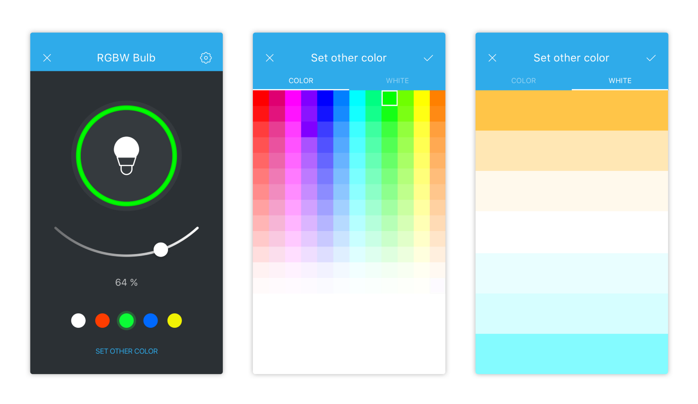
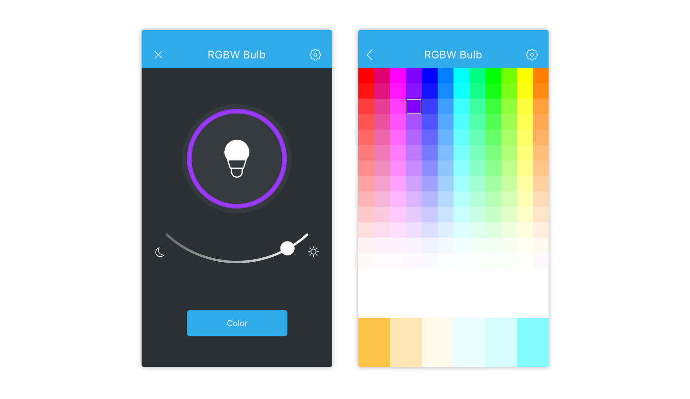
We included all other ideas suggested by the respondents into either of the two concepts. As a result, we ended up with the following two prototypes:
The main points of both prototypes:
- The ON/OFF control. No problem here. Our users had a clear idea of the way they wanted to turn the light bulb on or off. There were some differences about whether the ON/OFF state should be explicitly marked on the screen, but we used a graphic image for the ON state and marked only the OFF state. Here, we only added the colored outline showing the current color of the light bulb.
- The brightness control. Here, all our respondents suggested a slider. Some included a percent value, others preferred only the min and max values which we included in our prototypes.
- The lightbulb icon. Originally, the icons were meant to show two device states — ON and OFF. For a clearer visual effect, we were going to show the ON state with a solid color icon and the OFF state — with an outline. We could not use the gray color to avoid the “disabled device” perception. Our graphic designer created more than 20 icons. After analyzing the first dozen, we realized what was wrong with most of them. A smart light bulb has no filament. If we used that icon, it could look weird to the new generation of users, just like floppy disks or rotary phones. You can see the initial icons below. Look at them and tell us whether they seem strange to you — we would really appreciate your feedback.
We studied the rest of the icons and finally selected the one that you can see in the template.
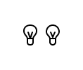
Bulb icons
- The color selector. We had to reject the usual color wheel for a number of key reasons. First, including a color wheel leads to very ineffective use of the screen space. The color selector is a functionally loaded UI element, and on smaller screens, color wheels may be inconvenient for very low resolution. The second factor was of a more technical nature. Our tests of RGBW light bulbs showed that they were unable to return the 16 million of colors that the manufacturers claimed. Thus, we reduced the palette to 12 colors based on the classic RGB color wheel and added the gradients of -8% of the main color. A direct switch to pure white was a mandatory element in all cases.
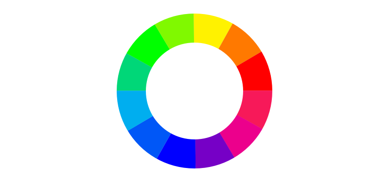
RGB color wheel
At the same time, both template concepts had certain key differences. The first one had the following main features:
- Link to the color selection screen
- Color selector and white balance control under two separate tabs
- Color selection confirmation by tapping a checkmark in the top right corner
- Light bulb brightness in percent
- Preset basic colors.
The second concept consisted of two screens where the color wheel and the white balance were joined into one. Other features included the following:
- The brightness control slider had a night lamp brightness at one extreme point (the light bulb does not turn off in this case) and the maximum brightness at the other
- A large color selector button
- No preset colors
To be continued…
With these two template concepts, we were ready for the final stage of our experiment. Make sure you read the third part of our story where we will show you our “perfect template”.

