LOADING...
RGBW bulb research, or How to make a UI design that works. Part 1
- March 30, 2022
- by Ezlo Admin
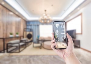
The main purpose of a home automation system is smart device management. Therefore, one of the most important tasks is designing a user-friendly, effective, and intuitive interface for managing locks, switches, thermostats, plugs and, of course, lights.
It may seem that managing a light bulb is one of the easiest processes. Indeed, what is there to manage? Turn on — turn off, what’s the big deal?
That’s true if we are talking about simple light bulbs that only support switching on and off. But what if it is a smart RGBW light with 16 million colors, a dimmer function and a white balance setting? That requires a more complicated setup flow and a corresponding UI design.
That was a challenging task for the eZLO designers. The problem was not that we did not know how to design the light bulb template. On the contrary, we had too many template solutions that were sometimes quite different. To create the most convenient template, we did a two-week research based on user testing. The results turned out rather interesting, and we would like to share them with you.
This is the first article in our series. Our research turned out to be so effective and exciting that it deserves a detailed description.
The task
Our initial task was to create a general mobile interface for controlling any smart RGBW light bulb. Such light bulbs are produced by many brands, and may have different functions. However, the basic functionality usually includes the following options:
- Switching on/off
- Dimmer function to control brightness
- Red-green-blue settings allowing to select any of the 16,000,000 available colors
- White balance control to select warm or cold white light, as well as any level in-between
- Quick switching from a colored light to pure white
The only special condition was that we were to create a cross-platform template that looked and performed in the same way on iOS and Android.
The research preparation
Our experience of designing mobile templates immediately suggested that we needed a deep research to find a perfect design for such light bulb control. We studied about two dozen RGB, RGBW and white light bulbs by different manufacturers using different communication technologies — Z-Wave, BLE, or Wi-Fi. Out of the box, most of them were controlled either via a dedicated mobile app or with a physical device. Our task was to integrate them in the eZLO app.
Here, we will not go into details describing the differences between the light bulbs we analyze, we are planning a separate article on those. For the moment, it will be enough to say that all of them had the basic functionality we wanted.
Having determined the required functionality, we put together the list of participants. We invited eZLO employees from different departments to take part in our experiment. We could easily get a quite diverse group of participants within eZLO, thus we did not need to invite people beyond the company. We used the following criteria to select the participants for our research:
- Age range: 18–45
- Degree of involvement in the development of light bulb templates and the eZLO product as a whole
- Education
- Knowledge of home automation and the related technologies: from “basic knowledge” to “using home automation systems in their apartments”
- Willingness to install smart devices in their homes
- Smart light bulb experience: from “never used it” to “QA engineers”
- Preference of iOS or Android smartphones
As the result, we selected 11 people who matched these criteria.
The scenario
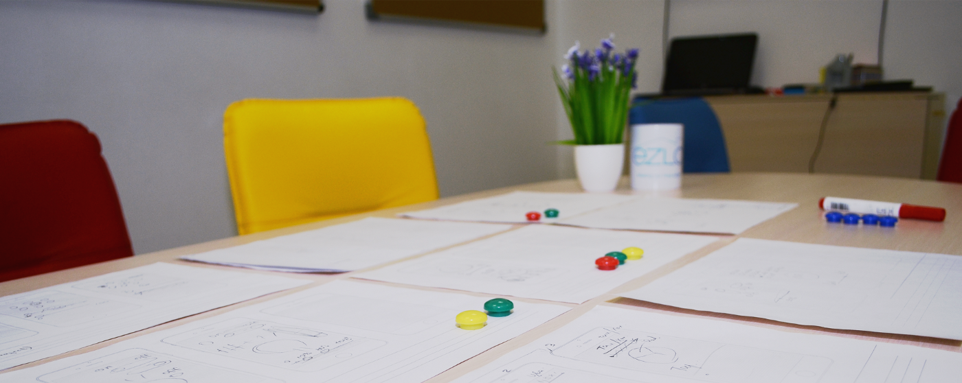
Initially, we planned only one testing round where the participants were offered a set of blocks taken from applications by other brands. We chose several light bulb control UI elements that we found to be the most frequently used, printed them and cut them out to place on the table in front of each respondent. Also, we printed several smartphone mockups and were going to ask each of our participants to put together the UI for their “dream light bulb”.
At this point, we realized that this scenario placed the respondents who had never used a smart color light bulb at a disadvantage. By showing them the examples of what UI elements could look like we immediately narrowed their imagination, thus risking to miss some truly valuable insights.
As we wanted to get as much feedback as possible, we decided to break the research into three stages:
- Asking the respondents to describe their vision of the “perfect template” based on their knowledge of smart light bulbs and home automation in general.
- Proposing them to modify their original concept taking into account their vision and the suggestions made by other participants. We were still pursuing the “building blocks” principle, however, in our case the blocks were suggested by the respondents themselves, rather than taken from third-party applications.
- On the basis of the data gathered on the previous stages, creating an interactive prototype and testing it with the same users. As a result, we hoped to get our “winner”, the “dream prototype”. By the way, we were somewhat surprised to see two patterns of behavior that our respondents fell into, but we will get to them a bit later.
Stage One
We approached each of our participants to schedule the date and time when they could take part in our testing and started inviting people to the design department.
We began working with each respondent by explaining why we needed their input and how they could help us. Then we asked a couple of questions on what our guests knew of the devices and technologies we worked with and whether they were willing to have smart devices at home. This way, we validated our respondent selection.
Afterwards, regardless of whether our guests were new to home automation or had some experience with it, we demonstrated a RGBW light bulb and its basic functions, making sure we never showed the interface we used to control it.
Then we proceeded with the design. Each participant was given a pencil and a sheet of paper and asked to draw their “dream UI” including anything they wished. The one and only requirement was to “make it convenient for you”. We convinced our guests that our design and development team could implement anything at all, so our respondents were not to worry about technical limitations. One last detail — their perfect flow could include as many screens as they chose.
We started with the simplest of functions and increased the complexity as we went along. The first task was “Think how you would like to turn the light on and off with your mobile app”. Then we asked to add the dimmer function, after that — the color selection.
This is when our respondents began running into first troubles — some tried to fit everything in a single screen, while others designed the layout so that secondary functions were moved to the next screen. Here those focused on using only one screen started to forget that the UI had to be convenient — they simply tried to “fit everything in”.
The problem became even bigger when we asked to implement the selection of warm or cold white with a quick switch from a colored light to white. Some respondents began using the second screen for this function, however, several people rearranged the components to fit them in the single screen again.
Here we noted that all respondents (those who used a colored light bulb at home or at work and those who did not) were unanimous on one point — the white light was their priority setting, as this is what they were going to use most often. Color selection could attract some interest in the first couple of weeks after starting to use the bulb while the user tests the device and tries all functions just to see what the device can do. Apart from that, color settings can be used for some parties or movie nights, and that’s it.
Below are a couple of prototypes our respondents created:
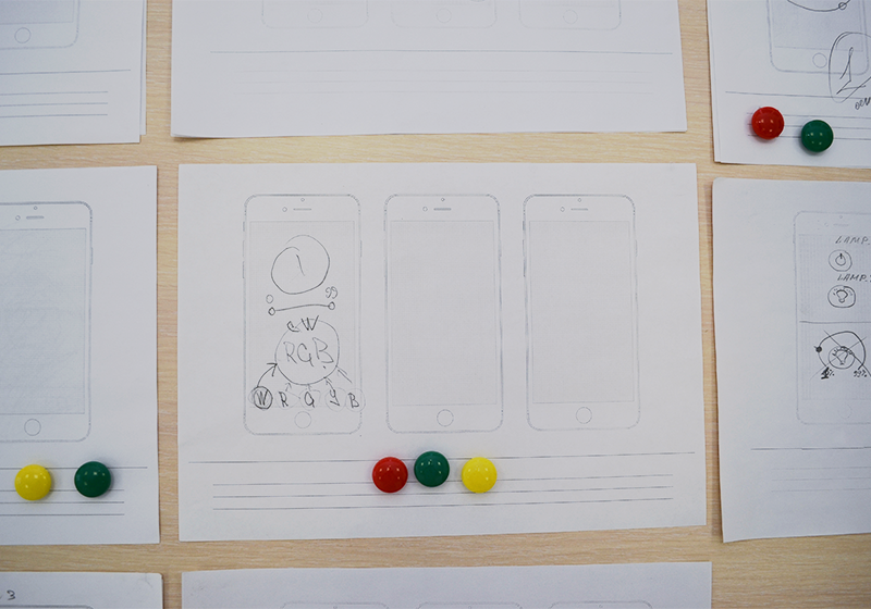
Respondent #4
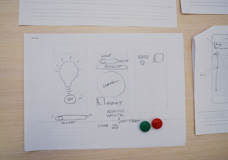
Respondent #6
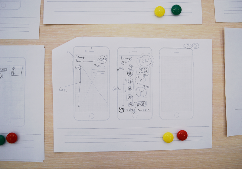
Respondent #7
Stage One Results
This test brought some very valuable insights. We could identify many similarities in the prototypes created by different people. At this point, we clearly saw that our users made absolutely no reference to the smartphone platform they were used to (spoiler: unlike Stage Three).
We could see where the respondents’ technical background started to play its part — they paid more attention to the restrictions that could be imposed by the device, technology, or code, such as brightness setting in the range of 0 to 99 or 1 to 100; color setting according to the RGB “255 255 255” format; a standard color wheel usually found in graphic editors; warm/cold white setting in the “C — CW — W” format, and so on.
At the same time, we saw quite a lot of interesting ideas that, most probably, could never appear if their authors had seen the light bulb UI before and had some notion of what it should look like. However we were totally unprepared to see that only few of our participants took into account the main requirement — “make it convenient for you”. All other respondents, frankly speaking, did not know or could not imagine what was convenient for them. Very often we heard such reasoning as “Are users convenient with this?”, “Nobody will understand it”, “Can I do it like this?”, and so on.
To be continued…
In the next article, we will describe how we used the results of the first stage of our experiment to continue creating the perfect light bulb control UI.