LOADING...
RGBW bulb research, or How to make a UI design that works. Part 3
 (1 votes, average: 5.00 out of 5)
- March 22, 2018
- by webdev_comodo
This is the final part of our experiment aimed at building the best UI template for smart light bulb control. You can find the description of the previous stages in Part 1 and Part 2 of our series.
At the previous stages, we asked our colleagues first to draw their vision of the most usable light bulb control UI and then to modify and improve it using the ideas suggested by their participants. As a result, we created two prototypes that combined most of the features that our respondents proposed.
Stage 3 preparation
After we finished with the prototypes, we started preparing for the final stage of our user testing. Our prototypes had turned into actual concepts, and we built and linked them in InVision and uploaded to two different smartphones.
We took into account the fact that people always tend to compare things and the theory that claims that we usually like the first choice better. Thus, we decided to do a lottery game and prepared five tickets for the first version and six tickets for the second one. This way, both concepts had equal chances to be the first to review. Each respondent drew a ticket and took the smartphone with the same number. The used tickets were removed from the lottery.
We began each session with an introduction stating that our task was not to choose the best of the two interfaces. If someone did not find their suggestions in the prototype, this did not mean that the suggestions were wrong or that we discarded them. We built the two prototypes trying to resolve the problems that the users faced during the first two stages. An important point is that we planned our interfaces for long-term use. We wanted them to be used every day for a long time, thus, routine cases should be as convenient as possible.
After that we described our session — it was a standard usability test: say what you see on the screen; describe the interface elements; before tapping anything, say what you are going to do and what you expect to achieve.
To cut a long story short, we will skip the testing details and proceed to our final conclusions and to the “perfect template” that we built on the basis of the results of our experiment.
The result
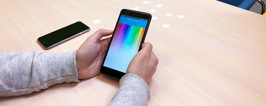
The majority of respondents preferred the combined color palette and white balance selector. Here, the experience obtained during the testing had its effect. The respondents spoke well of the combined palette and said that in the long-term perspective, it was more convenient and usable than switching between two palettes.
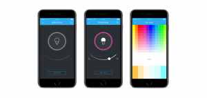
How we designed the first screen:
- During the testing we noted how the participants used the dimmer. Here, the designers’ personal experience also played its part. Brightness level expressed as a number extends the time needed to set it. Users subconsciously focus on the numbers and try to set the brightness in a particular range. For perfectionists, such numbers as 34 or 21 are totally unacceptable, they will try to get a round number while this will make no difference as to the brightness as such. Therefore, we designed the dimmer with no numeric or other values, so that users could set the brightness visually without fixating on specific values. This approach reduced the time needed for the dimmer setting.
- Many respondents found the large color selector button too aggressive and dominating as compared to the main control on that screen — the ON/OFF button.
- While testing the new palette, the respondents agreed that preset colors were not necessary, as it was quite easy to find the favorite color in the palette. Note: the home automation system allows creating scenes and presets not only for light bulbs but for other devices as well.
The second screen. The combined palette was changed a bit, too.
- The first thing we did on this screen was removing the color selection confirmation and the settings. The confirmation turned out to be more confusing than usable. This mostly concerned the Android users who were accustomed to return to the previous screen by tapping an arrow in the top left corner or by using the smartphone buttons. For them, a confirmation check mark in the top right corner was counter-intuitive. Very often, the user would select a color and then just close the application.
- For the same reason, we removed the settings from that screen — some users were confusing the palette settings with the light bulb settings.
- During the tests, we noticed that for some people it was difficult to distinguish very light colors, thus the switch to pure white was somehow blurry. To handle this problem, we reduced the number of grades setting them at 10%. This way, the border between the colored and the white became better visible without affecting the LED lamp functionality. This also allowed increasing the touch area of switching to white and of the warm/cold white setting.
- We did another minor modification to the palette — we shifted the color row. We thought that rich red colors were used more often than yellow and orange. Moreover, the yellow and orange could be found in the bottom of the palette. Thus, we discreetly moved the reds farther away from the top left corner where the “X” button is located to minimize the chance of accidental closing of the palette while choosing a red color.
- We marked the switch to white with a text box not to confuse the users with an “empty” space.
The final thoughts
That completed our experiment of creating the perfect template for smart light bulb control, and we sent the approved prototype to the developers.
In conclusion, we would like to share our observation that, when you do such user testing, you may find a very diverse respondent community. After we finished our tests, we asked everyone the same two questions: “Which stage did you like best?” and “Which stage was the most difficult for you?”
At this point we realized how different people may think. While to the first question most of our respondents said that they liked the second stage best for its gamification, the second question returned quite different answers:
- The first stage was the most difficult — I had to imagine something and was afraid to suggest a bad idea or say something wrong. I never gave much thought to what was convenient and what wasn’t.
- The second stage — On one hand, there were already some restrictions, but anyway there were so many options that I had to try all of them. And I was getting a bit angry with myself for not thinking of some cool things at the first stage.
- The third stage — The responsibility increased. There were only two choices, and my opinion could decide the fate of the template. Besides, my suggestions from the first two stages were not used, which means that the others’ ideas were better.
Do not be afraid of testing and researching. If you find time for it, your product will definitely benefit from it and turn out to be a true “perfect solution”.